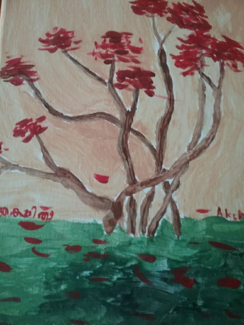
Autumn Maple
Warm coloured palette
This painting was my first one for Genius Hour 2017, and it was inspired by Canadian artist Tom Thomson's artwork 'Maple Saplings'. My palette consisted of christmas red, daffodil yellow, tan, cinnamon brown, and christmas green paint, which I mixed with daffodil yellow to give it a warm feeling. To make the peach in the background, I mixed yellow with a drop of red, and I used various blending techniques for the branches.
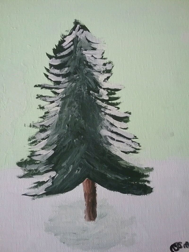
Snow-dusted Fir
Blending using black and white paint
For this painting, my very limited palette consisted of christmas green, neon green, cinnamon brown, black, and white paint. I made a nice shade of green, then I created a 'family' of colours, to make sure that the colours that I already had wouldn't dry while I created a new one.
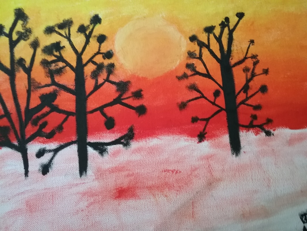
Winter Twilight
Experimenting with oil paints
For most of my art pieces, I drew with a pencil and painted with acrylic paints, but for 'Winter Twilight', I did something different. Since I forgot to bring a palette, I had to borrow one from a friend. She also happened to have oil paints with her that day, which she said I was allowed to use. My palette consisted of scarlet, vermilion, lemon yellow, and lamp black paint. I discovered that oil paints are much stickier than acrylics, and take much longer to dry, because of their siccative drying method.
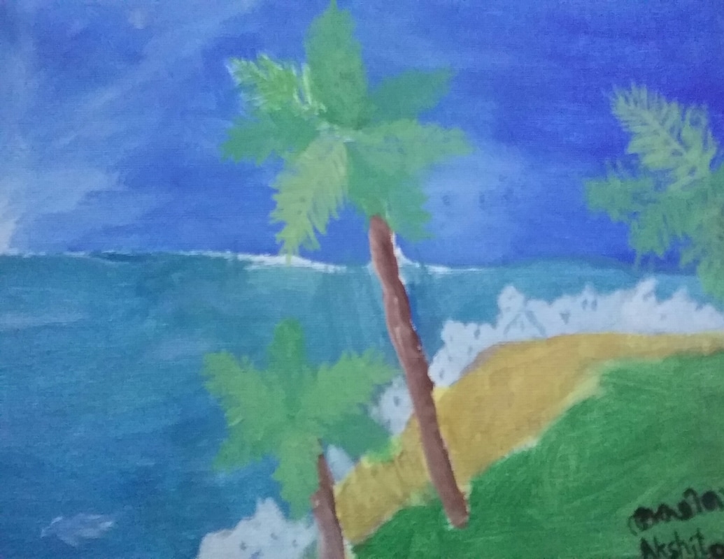
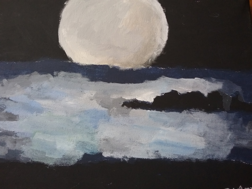
Coastal View
Mixing Acrylic Paints
For 'Coastal View', I mixed colours such as turquoise and light green using a palette made of peacock blue, christmas green, daffodil yellow, spun gold, and cream paint. The turquoise ocean was extremely hard to make. On my first try, I ended up with a strange blue-gray, so I tried again. I kept on adding more yellow, blue, and a little white to balance it out, until I ended up with my achieved shade of blue-gray.
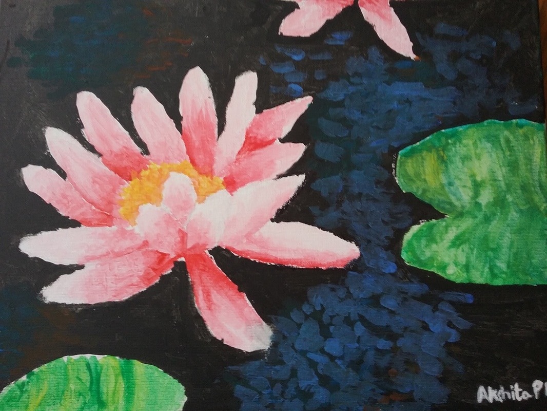
Lotus on a Lake
Colour contrast
For 'Lotus on a Lake', I used colour contrast. I made two light pink lotus blossoms and two light green and yellow lily pads on a black lake with some shimmer. After making this artwork, I understood that contrast makes the object(s) in view more visible, helping the viewer see the art.
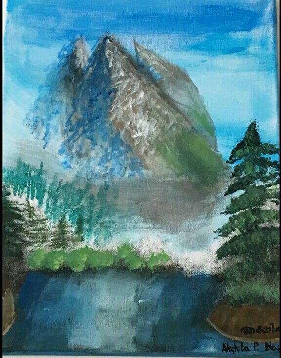
Mountain Peaks
Variation an another artist's works
'Mountain Peaks' is a variation of artist Bob Ross' 'Valley View'. After watching his video, I used the same techniques for the evergreen trees and a similar lake. After making it, I realised that substituting the knife that he used with an angled paintbrush didn't have the same effect, but, like all of my other paintings, 'Mountain Peaks' was an experiment.
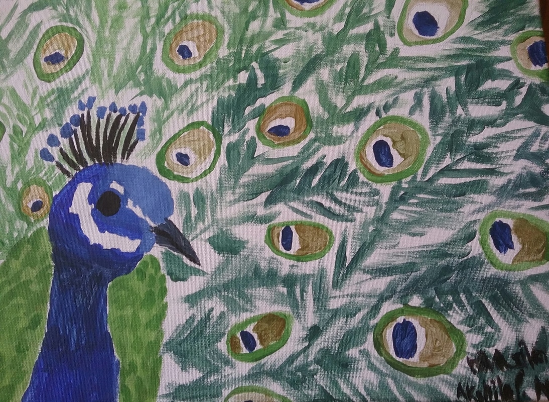
Nature's Splendor
Experimenting with Tempera Paints
On the day that I made 'Nature's Splendor', I didn't have black paint with me. I ended up using some of the class' tempera paint for black areas and mixing colours. The tempera paint worked, but it was thicker and was hard to get the right shades with. My palette consisted of christmas green, peacock blue, spun gold, daffodil yellow and black tempera paint. After making the base shades, I did some shading with the green by mixing it with gold, and I made an affect of light by making the feathers at the top pure green, and by mixing more blue in as I went.